Six directions for Ashwin's site

Every concept is built from his real bio, CV, credits, rates and screenplays — nothing here is invented, and anything that couldn't be sourced is left as a marked placeholder. Photography is hotlinked from the live Squarespace CDN. 01–03 are single pages that make the offer legible fast. 04–06 are full multi-page sites with the depth his CV actually supports. Open them side by side and pick the one that feels like him.

Each one opens in a new tab, so this page stays put for comparing.

The site today ashwinmitchell.com, as it stands A faithful copy of his live Squarespace site — the baseline every concept below is arguing with. Photography-led, writing behind a password, rates on a single page. Open the current site →(opens in a new tab)

Six alternatives

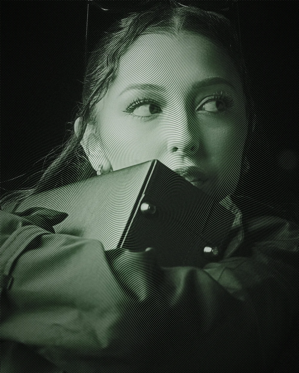
Dark cinematic night frame

Concept 01

Marquee

Dark and cinematic. A full-bleed title card, then three plain-language cards for what he takes off your plate, an asymmetric work grid, and a three-step process.

  • Leads with mood, closes with a rate
  • All four scripts, with samples
  • Longest scroll of the single-page three
  • Two contact CTAs above the fold

Best for: impressing directors and creative leads who want to feel the work first.

Open Marquee(opens in a new tab)
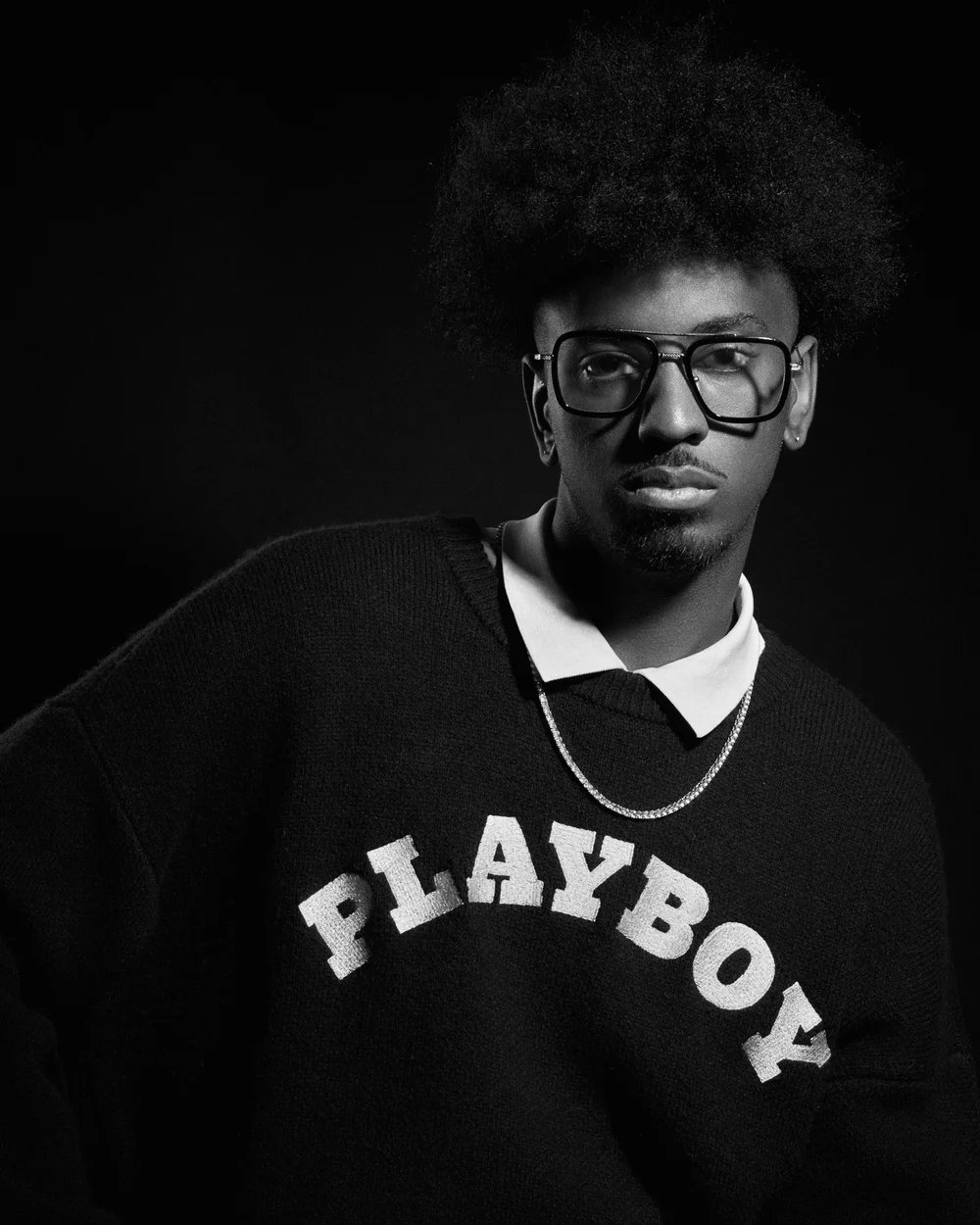
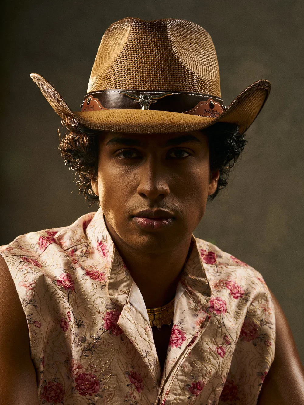
Portrait of Ashwin Mitchell

Concept 02

One-sheet

Light and businesslike. A sticky hire card on the left; on the right a rates table, credits, FAQ and a project-brief form. Everything a producer needs to say yes.

  • Prices visible without scrolling far
  • Answers the five questions people email to ask
  • Structured brief form, not just an address

Best for: producers and clients comparing options on budget and scope.

Open One-sheet(opens in a new tab)
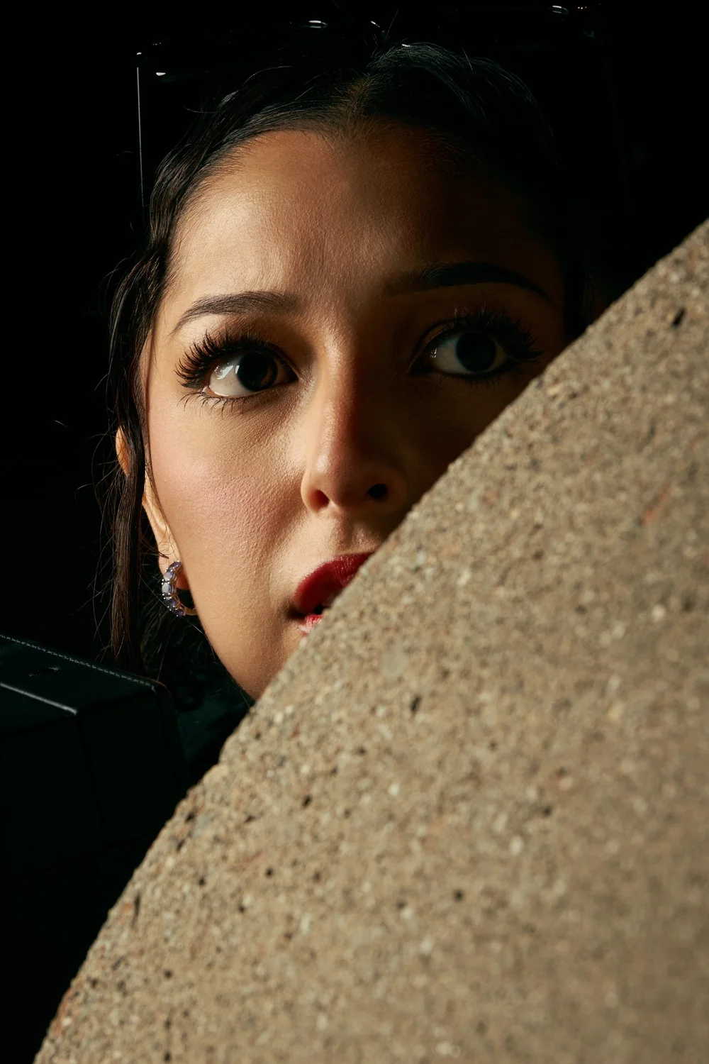
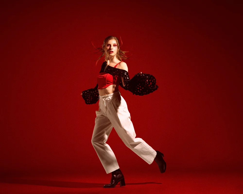
Portrait in red light

Concept 03

Index

Minimal and typographic. One statement, a priced index of capabilities with hover previews, a scrolling evidence strip, and a contact bar fixed to the bottom of the screen.

  • Whole offer readable in about 15 seconds
  • Adapts to light and dark automatically
  • Built for a link in a bio or a DM

Best for: sending cold to someone who will give the page ten seconds.

Open Index(opens in a new tab)
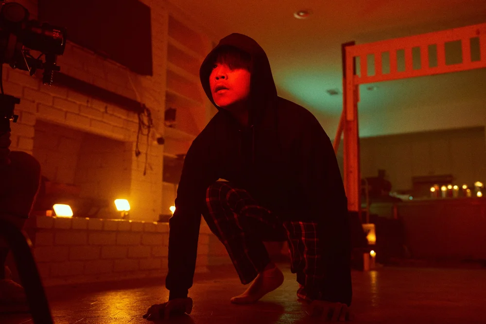
Night frame from The Getaway

Concept 04 · 9 pages

Studio

A warm, gallery-like editorial site. Large photography, serif display type, breadcrumbs and case studies — the work is exhibited, and hiring him is the obvious next step from any page.

  • Case studies for The Getaway and Across the Line
  • Separate rooms for writing, stills and services
  • The most beautiful of the six

Best for: being sent to someone who should be impressed by the eye first.

Open Studio(opens in a new tab)
Unit still from a film set

Concept 05 · 7 pages

Dossier

Credit-dense and industry-facing, like a representation packet. Dark, tight typographic grid, sectioned filmography tables with a department filter. Depth and verifiability are the aesthetic.

  • Every credit on the CV, in tables that stack on a phone
  • Dedicated awards and teaching pages
  • The four specs as development entries

Best for: producers, reps and execs who assess on the record.

Open Dossier(opens in a new tab)
Portrait from Across the Line Vol. 2

Concept 06 · 8 pages

Workbench

The honest early-career site, in first person. Bright and personable, organised around how he works and what it is like to hire him — which is what people actually take a chance on.

  • A real process page, per service
  • Rates explained, plus what moves a quote
  • Positions him as new without apologising for it

Best for: a first-time client who needs reassurance more than polish.

Open Workbench(opens in a new tab)

What's true of all six